FITNESS APP
TrainUp
TrainUp
An end-to-end mobile fitness app, designed around three real people with no gym, no time, and no experience. I took it from user personas and user flows to a full design system and high-fidelity screens, with accessibility built in from the start.
An end-to-end mobile fitness app, designed around three real people with no gym, no time, and no experience. I took it from user personas and user flows to a full design system and high-fidelity screens, with accessibility built in from the start.
Case Study
UX/UI Design
Mobile
Accessibility
B2C
MY ROLE
UX/UI Designer
UX/UI Designer
TOOLS
Figma · Photoshop · Affinity
Figma · Photoshop · Affinity
TYPE
Concept Project
Concept Project

the brief
A fitness app built around the person, not the gym
A fitness app built around the person, not the gym
TrainUp was designed to remove the barriers between people and their next workout. No gym required, no experience needed. The goal was simple: a mobile app that adapts to real people with real constraints, and makes starting easy.
TrainUp was designed to remove the barriers between people and their next workout. No gym required, no experience needed. The goal was simple: a mobile app that adapts to real people with real constraints, and makes starting easy.
the problem
Built for the fit. Not for everyone else
Built for the fit. Not for everyone else
Most fitness apps are made for people who already know what they’re doing. Everyone else is left to figure it out alone: the beginner scared of being judged, the parent with 20 minutes and no babysitter, the retiree who wants to move but doesn’t know how.
There’s no shortage of fitness content. What’s missing are apps built around the person using them. Their time, their equipment, their goals, their body.
How might we make a fitness app so personal and easy to use that the hardest part is the workout itself, not finding it?
How might we make a fitness app so personal and easy to use that the hardest part is the workout itself, not finding it?
the research
What’s out there, and what’s missing
What’s out there, and what’s missing
This project started with three people close to me: an older woman who has never been inside a gym, a busy mom with almost no time for herself, and me, with some equipment at home and a full schedule. Three very different needs, and the same problem: nothing out there was built for any of them.
This project started with three people close to me: an older woman who has never been inside a gym, a busy mom with almost no time for herself, and me, with some equipment at home and a full schedule. Three very different needs, and the same problem: nothing out there was built for any of them.
APP
PRIMARY FOCUS
GAP IDENTIFIED
Nike Training Club
Nike Training Club
Beautiful UI
Beautiful UI
Gym-focused, overwhelming
Gym-focused, overwhelming
MyFitnessPal
MyFitnessPal
Calorie tracking
Calorie tracking
Workouts are secondary
Workouts are secondary
Strong Workout
Strong Workout
Experienced lifters
Experienced lifters
Not beginner friendly
Not beginner friendly
7 Minute Workout
7 Minute Workout
Quick workouts
Quick workouts
Rigid, one size fits all
Rigid, one size fits all
Fitbod
Adaptive workouts
Adaptive workouts
Complex, expensive
Complex, expensive
Home Workout App
Home Workout App
Home exercises
Home exercises
Doesn't adapt to user goals
Doesn't adapt to user goals
Not one app asked who you were before telling you what to do. They assumed your equipment, your experience, your time, and your goals. TrainUp asks first.
Not one app asked who you were before telling you what to do. They assumed your equipment, your experience, your time, and your goals. TrainUp asks first.
APP
PRIMARY FOCUS · GAP IDENTIFIED
Nike Training Club
Beautiful UI · Gym-Focused, Overwhelming
Strong Workout
Experience lifters · Not beginner friendly
7 Minute Workout
Quick workouts · Rigid, one size fits all
Fitbod
Adaptive workouts · Complex, expensive
Home Workout App
Home exercises · Doesn't adapt to user goals
MyFitnessPal
Calorie Tracking · Workouts are secondary
the users
Three people. Three completely different needs
Three people. Three completely different needs
TrainUp wasn't designed for the average user. It was designed for three very specific people the fitness industry keeps forgetting.
TrainUp wasn't designed for the average user. It was designed for three very specific people the fitness industry keeps forgetting.
Alex, 30 · Full-time worker Fitness enthusiast
MOTIVATION
Build muscle and stay active
FRUSTRATION
Endless options, no clear starting point
CONSTRAINT
Under 30 mins · basic equipment · no gym
Sarah, 35 · Part-time retail worker, mother of two
MOTIVATION
Energy and strength to be present for her family
FRUSTRATION
Fitness plans feel complicated and hard to maintain
CONSTRAINT
Unpredictable schedule · early morning or late night only
Linda, 67 · Retired teacher, grandmother
MOTIVATION
Stay mobile and independent for her grandchildren
FRUSTRATION
Gym feels intimidating · fears injury from wrong exercises
CONSTRAINT
No gym · basic equipment · needs low-impact guidance
the PROCESS
Designing around the person, not the feature
Designing around the person, not the feature
I didn’t start with how TrainUp should look. Every decision started with a person, a problem, and one question: what’s the simplest way to solve this?
I didn’t start with how TrainUp should look. Every decision started with a person, a problem, and one question: what’s the simplest way to solve this?
Feature prioritization: deciding what to cut
I had a lot of ideas at the start: a custom workout builder, advanced filters, calorie tracking, meal plans, and social features. I checked each one with the same question: does this help someone work out, or does it make them think more?
I cut the custom workout builder. Adding and removing exercises by hand creates the same decision fatigue TrainUp was meant to solve. I removed calorie tracking, because it isn’t relevant to everyone and it adds complexity. And I cut the social features, because competition is the opposite of what Linda and Sarah need.
Every feature I removed made TrainUp better.
Custom workout builders, advanced filtering, calorie tracking, meal planners, and social features. Each idea was evaluated against one question: Does this help the user work out, or does it make them think more?
The custom workout builder was cut. Giving users the ability to manually add and remove exercises introduced the same decision fatigue TrainUp was designed to eliminate. Calorie tracking was removed — not relevant to all users and directly contradicts the frictionless philosophy. Social features were cut — competition is the opposite of what Linda and Sarah need.
Every removed feature made TrainUp stronger. Subtraction was the design process.
Onboarding
Onboarding
Seven screens, one question each, so nobody feels overwhelmed.
Seven screens, one question each, so nobody feels overwhelmed.

Before users see a single workout, TrainUp learns who they are: their goal, fitness level, available time, equipment, how often they want to train, preferred days, and reminders. It asks one question at a time, using progressive disclosure.
One question per screen was a deliberate decision. A single form with seven fields would feel like a gym intake form. Cold, intimidating, and easy to abandon. One question at a time feels more like a conversation.
Every screen has a Skip option, so users are never forced to answer. I wanted people to feel in control from the first tap. If an app respects you before you even start, you’re more likely to trust it.
The last screen says: “You’re all set! We’ve built a personalized workout experience just for you.” After seven quick questions, the user goes into the home screen feeling ready, not nervous about where to start.
Home screen: designed to build habits
Home screen: designed to build habits

Workout library & filters: more control when you need it
Workout library & filters: more control when you need it
The workout library gives users access to every workout in the app. But too many options without structure creates the same overwhelm TrainUp was built to avoid.
The filters let users narrow workouts by duration, equipment, goal, and level, separate from what they chose during onboarding. Because life changes every day. Alex has 45 minutes on Saturday but only 15 on Tuesday. Sarah’s baby slept badly, so she needs something lighter. Linda’s knee hurts, so she needs to skip lower body workouts.
On the home screen, I keep choices to a minimum to reduce cognitive load. In the library, the filters are there for users who want more control. That’s progressive disclosure: the right information at the right moment.


The workout card: information architecture
The workout card: information architecture
Three pieces of information. That’s all a user needs to decide if a workout is right for them.
Time, equipment, and body area are visible before a single tap. Everything else was left out on purpose. I removed calories, and replaced detailed muscle groups with simple body areas: Full Body, Upper Body, Lower Body. Clear enough for a beginner, still useful for someone experienced.
The save button gives users control. They can build their own collection without leaving the page they’re browsing. The goal is that someone can look at a card for three seconds and think: I have time for this, I have the equipment, this is right for me.
Three seconds to decide. That’s the information architecture of TrainUp in one card.
The workout detail: know what’s coming before you start
The workout detail: know what’s coming before you start
Before a single rep, users know exactly what they’re getting into: the exercise list, equipment, estimated time, and goal. All visible before they commit.
The Start Workout button stays fixed at the bottom. Always visible, never rushed. Users can read, get ready, and tap when they’re ready. It’s a small pause before starting, on purpose, because it helps people start with confidence.
Informed users are confident users.


The workout screen: designed for the real world
The workout screen: designed for the real world
Most app screens are designed for someone sitting at a desk. This one was designed for someone on a yoga mat, in a backyard, or in a living room with a baby nearby. Phone on the floor. Sweaty hands. Sun on the screen.
Every decision came from that physical reality.
Most app screens are designed for someone sitting at a desk. This one was designed for someone on a yoga mat, in a backyard, or in a living room with a baby nearby. Phone on the floor. Sweaty hands. Sun on the screen.
Every decision came from that physical reality.
Designed for real life, not the ideal scenario.
The cancel modal: ethical UX
The cancel modal: ethical UX
When users try to stop a workout, most apps use guilt. “Are you sure you want to quit?” “You’re so close!” Dark patterns pretending to be motivation.
TrainUp’s cancel modal says: “Break time... or one more rep? 🔥” Two options: Keep Going or Stop Workout. No shame, no manipulation.
The user decides. The app offers a gentle push, not a guilt trip.
An app that respects you when you’re struggling is an app you come back to.


Workout complete: the reward
Workout complete: the reward
Every habit needs a reward. The workout complete screen is where that happens.
It shows active time, the streak, and one encouraging message: “Consistency wins. Great work today.” No calories burned, no percentage completed. Just the fact that you showed up and finished. That’s what matters.
A button to the progress screen keeps the momentum going for users who want to track their progress.
The reward is showing up. Everything else is secondary.
Progress screen: celebrating consistency
Progress screen: celebrating consistency
Not everyone is motivated by numbers. Some people just need to see that they’re showing up.
The monthly calendar uses the same flame icons as the home screen streak, so the visual language stays consistent across the whole app. Milestone messages celebrate consistency, not performance.
Linda doesn’t need to know her heart rate. She needs to know she’s doing it.
Consistency first. Performance is optional.


Empty states: small details that matter
Empty states: small details that matter
Empty states are where many apps give up. A blank screen with no guidance is a dead end.
The Saved Workouts empty state has a barbell illustration, a friendly message, and one clear CTA: “Browse Workouts.” Instead of a dead end, the user gets a next step. They’re never stuck.
Empty states are where many apps give up. A blank screen with no guidance is a dead end.
The Saved Workouts empty state has a barbell illustration, a friendly message, and one clear CTA: “Browse Workouts.” Instead of a dead end, the user gets a next step. They’re never stuck.
The details nobody notices are the details that make everything feel right.
the PIVOT
When the right color was the wrong choice.
When the right color was the wrong choice.
The original primary color for TrainUp was orange. It communicated energy, warmth, and motion, which felt right for a fitness brand. It felt alive. It felt like movement.
Then came the accessibility audit.
A WCAG contrast check showed a critical failure. Orange buttons with white text scored 2.02:1, far below the 4.5:1 minimum for WCAG AA. And it’s not just a number. It’s a real problem for real people: sunlight glare, low screen brightness outdoors, users with visual impairments.
TrainUp was designed for everyone. A color that leaves people out goes against everything the product stands for.

The solution was Deep Blue-Grey (#36454F). Professional, calm, and strong. White text on Deep Blue-Grey scores 9.90:1, which meets WCAG AAA, the highest level.
Orange didn’t disappear. It became the accent color, used for highlights, streaks, and moments of energy across the app. It still brings warmth and motion. It just doesn’t carry the responsibility of accessibility anymore.
Function won over aesthetics. The best design decision in this project was changing something I loved.
the solution
The finished product
The finished product
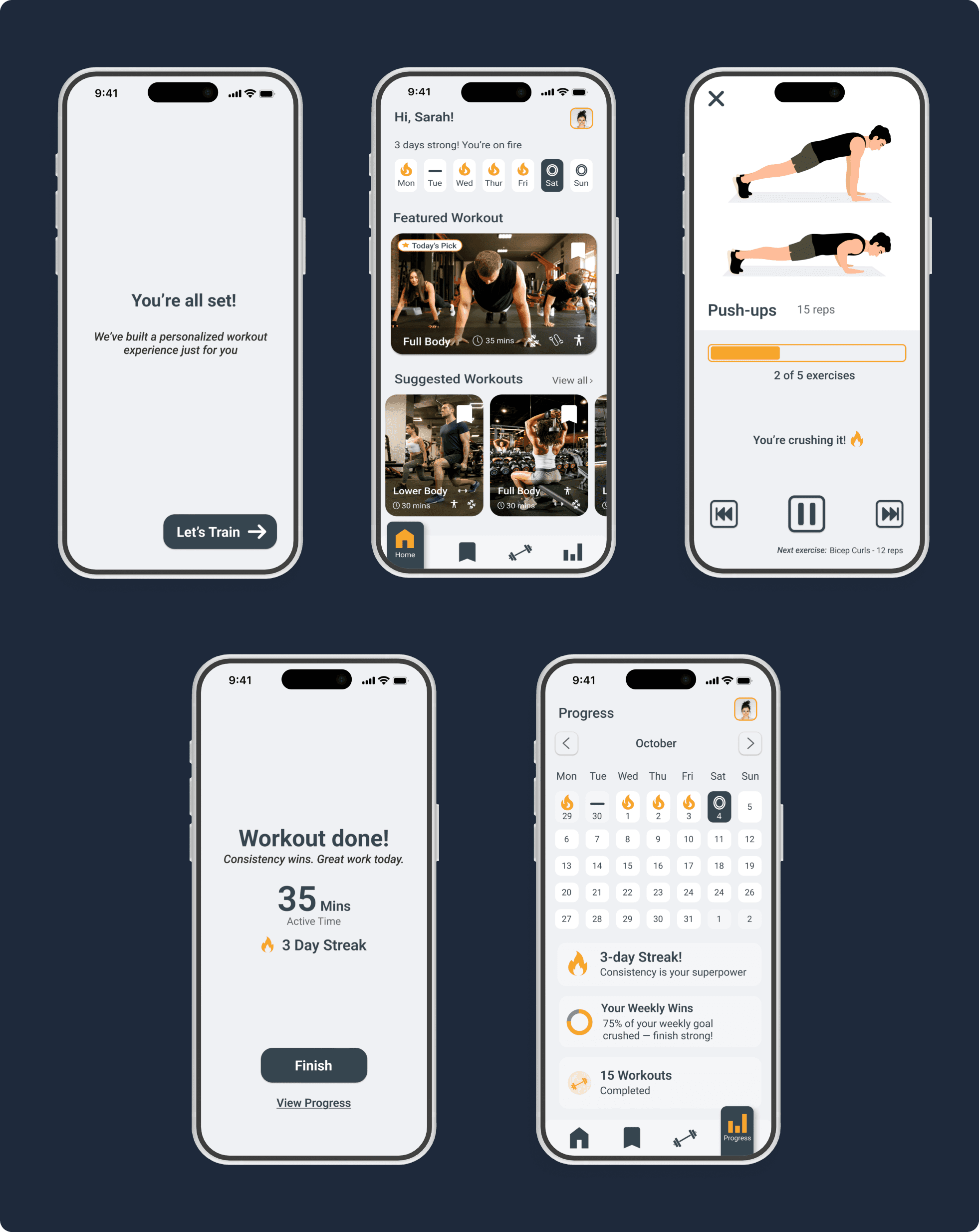
The research, the personas, the color pivot, and every feature I decided to cut all led here.
A fitness app built around real people, their time, their space, and their level. You don’t need a gym or any experience to start.
View Prototype

the ecosystem
One brand, three connected products
One brand, three connected products
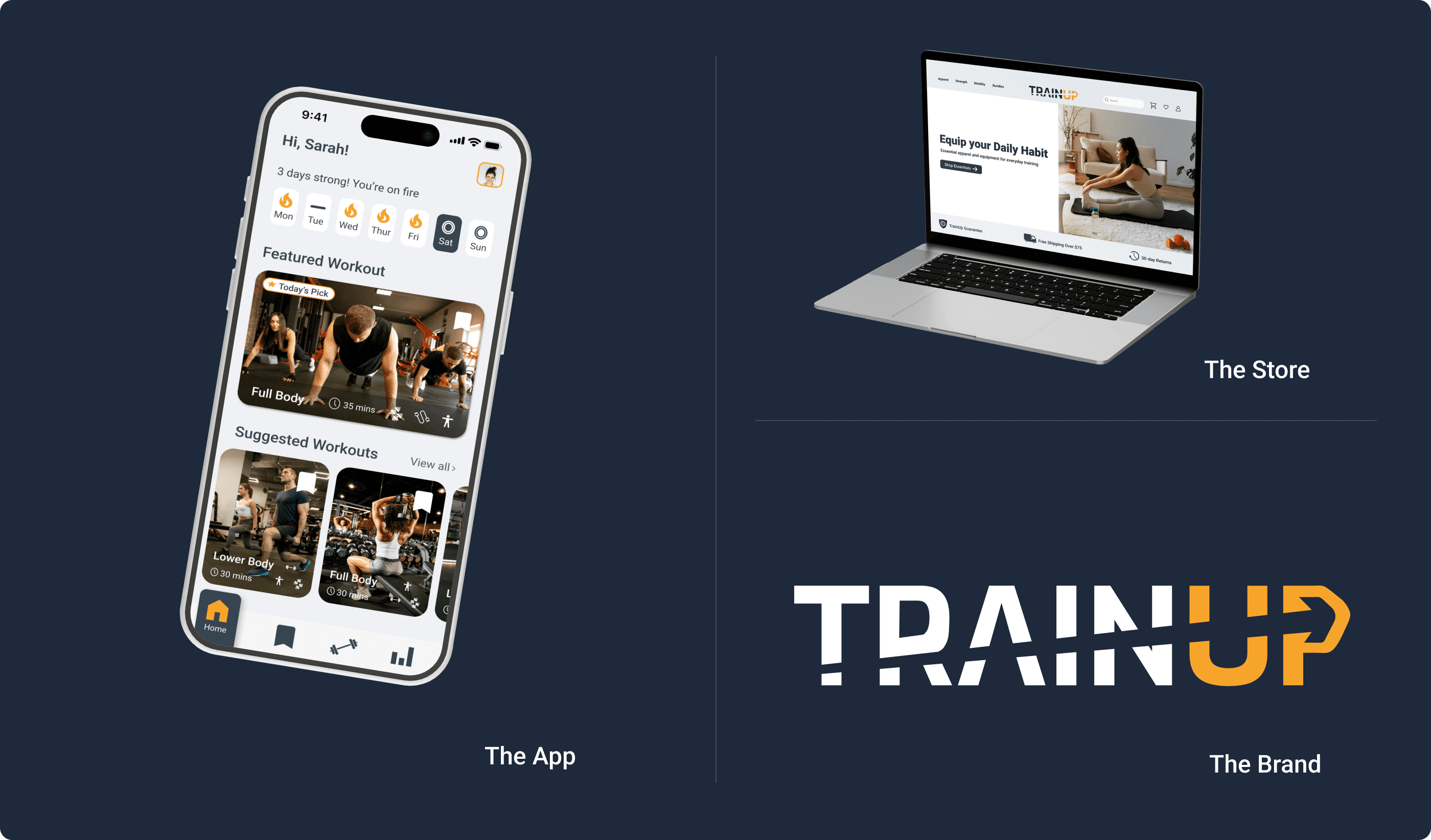
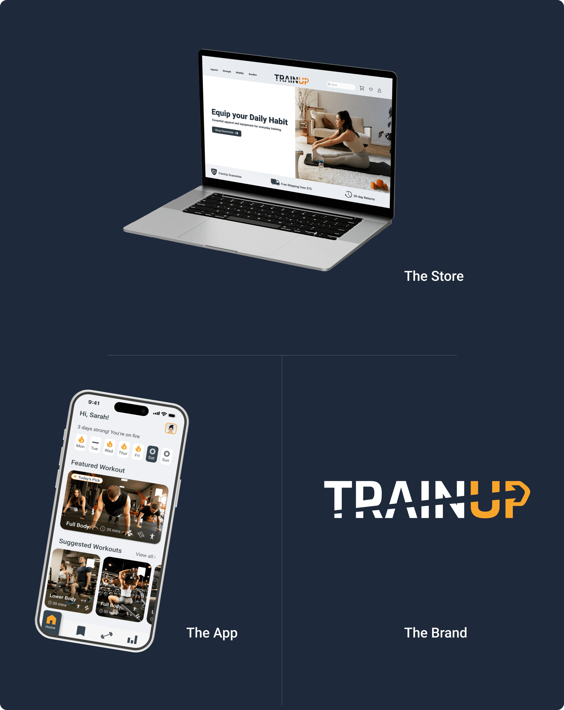
Most portfolio projects are a single deliverable. TrainUp is three products designed to work together as one system.
Most portfolio projects are a single deliverable. TrainUp is three products designed to work together as one system.
The connection
The brand identity is the foundation. Every color, typeface, and design decision in the app and the store comes from it. So TrainUp isn’t three projects with the same name. It’s one ecosystem with three ways in.
The brand identity is the foundation. Every color, typeface, and design decision in the app and the store comes from it. So TrainUp isn’t three projects with the same name. It’s one ecosystem with three ways in.
How they work together
A user downloads TrainUp and starts working out at home. Over time, they want better equipment. The store is the next step, organized around the same goals the app already knows about them.
Or a user finds TrainUp through the store, and the app becomes their next step. Each product leads to the other, which helps keep users that one product alone might lose.
The visual system
The app, the store, and the brand share the same colors, typography, and design language. Moving between the app and the store feels like the same place. That’s the design system doing its job.
The app, the store, and the brand share the same colors, typography, and design language. Moving between the app and the store feels like the same place. That’s the design system doing its job.
This is product thinking at the system level.
the REFLECTION
What TrainUp taught me
What TrainUp taught me
What I'm Most Proud Of
What I'm Most Proud Of
The restraint.
TrainUp could have been overwhelming. The feature list started long: custom workout builders, social features, calorie tracking, meal plans. I cut every one of them. They were interesting ideas, but they didn’t help the person using the app.
I kept asking myself: would I actually use this? Would Sarah? Would Linda? If the answer wasn’t yes, the feature was gone.
Everything left in the app is there because a real person needed it.
What I’d do differently
What I’d do differently
The onboarding flow was the decision I was least sure about.
Seven questions felt like the right number. Enough to personalize the experience without overwhelming people before they even start. But that decision was based on instinct, not real data.
Would a first-time user give up at question four? Would Linda feel intimidated? Would Alex skip it all to get to the workouts faster?
Without real users going through that flow, every onboarding decision was an educated guess. If I could go back, I would test it with five real people before building anything else.
What’s next
If TrainUp were a real product, the first step would be simple: get it into real hands as fast as possible.
I’d launch a free MVP with ads. Not because the design is unfinished, but because no amount of design thinking on my own can replace hundreds of users with different goals, fitness levels, and lives.
Real feedback leads to better versions. That’s how a product keeps improving.
TrainUp started as a personal problem. It became a product for everyone the fitness industry keeps forgetting. That’s still the goal.