E-COMMERCE
TrainUp Store
TrainUp Store
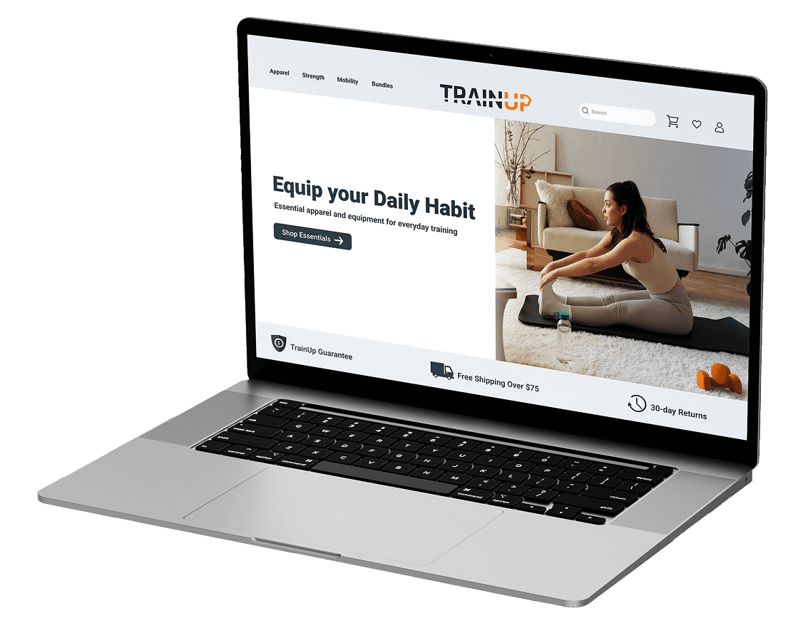
A fitness store that helps people find exactly what they need, without the overwhelm.
A fitness store that helps people find exactly what they need, without the overwhelm.
Case Study
UX/UI Design
Web Design
E-commerce
B2C
MY ROLE
UX/UI Designer
UX/UI Designer
TOOLS
Figma · PS · Affinity
Figma · PS · Affinity
TYPE
Concept Project
Concept Project
the brief
Built for the same person, not the average shopper
Built for the same person, not the average shopper
TrainUp’s e-commerce store follows the same idea as the app: put the person first and remove the barriers between them and their goal. A store that helps you find what you actually need, instead of pushing products at you.
TrainUp’s e-commerce store follows the same idea as the app: put the person first and remove the barriers between them and their goal. A store that helps you find what you actually need, instead of pushing products at you.
the problem
Most fitness stores are built to sell, not to help
Most fitness stores are built to sell, not to help
Endless product grids, aggressive upsells, newsletter pop-ups, and ads everywhere. Most fitness e-commerce sites are built around conversion numbers, not the person shopping.
The result? People land on a store, get overwhelmed by options, and leave without buying anything. Or worse, they buy the wrong thing.
How might we design a fitness store where everyone, no matter their age, experience, or goal, feels helped instead of sold to?
How might we design a fitness store where everyone, no matter their age, experience, or goal, feels helped instead of sold to?
the research
What good and bad e-commerce looks like
What good and bad
e-commerce looks like
The research for TrainUp’s store focused on one question: what makes fitness e-commerce fail the everyday user?
I found three patterns in the major fitness stores I looked at:
→ Products organized by type, not by goal. People need to already know what they want before they can find it.
→ Decision fatigue at every step. Too many options, too little guidance, and no clear path from browsing to buying.
→ Aggressive conversion tactics. Pop-ups, countdown timers, and forced newsletter sign-ups, made to pressure people instead of helping them.
TrainUp’s store was designed to do the opposite of all three.
TrainUp’s store was designed to do the opposite of all three.
the users
Same people, different needs
Same people, different needs
The TrainUp store serves the same three people as the app. Alex needs equipment to level up his home training. Sarah needs something simple and fast, without endless browsing. Linda needs clear guidance: the right product for her goals, and nothing intimidating.
The store was designed so all three can shop with confidence, without needing to know anything about fitness equipment first.
Alex, 30 — Full-time worker Fitness enthusiast
MOTIVATION
Build muscle and stay active
FRUSTRATION
Endless options, no clear starting point
CONSTRAINT
Under 30 mins · basic equipment · no gym
Sarah, 35 — Part-time retail worker, mother of two
MOTIVATION
Energy and strength to be present for her family
FRUSTRATION
Fitness plans feel complicated and hard to maintain
CONSTRAINT
Unpredictable schedule · early morning or late night only
Linda, 67 — Retired teacher, grandmother
MOTIVATION
Stay mobile and independent for her grandchildren
FRUSTRATION
Gym feels intimidating · fears injury from wrong exercises
CONSTRAINT
No gym · basic equipment · needs low-impact guidance
Everyone deserves to find exactly what they need, no matter how much they know about fitness equipment.
Everyone deserves to find exactly what they need, no matter how much they know about fitness equipment.
the PROCESS
Designing around the goal, not the product
Designing around the goal, not the product
Every decision in the TrainUp store started with the same question as the app: does this actually help the person, or does it make them think more?
Organizing by goal, curated bundles, the slide-out cart, a sticky Add to Cart button that keeps buying one tap away, and a simple checkout. Each one answers that question the same way.
Shop by Goal: the core decision
Shop by Goal: the core decision
Most fitness stores organize by product type: dumbbells, resistance bands, yoga mats. That works if you already know what you need. It doesn’t work for Linda, who just wants to stay mobile. Or for Sarah, who wants more energy. Or for Alex, who wants to build muscle at home.
Shop by Goal gives users three clear starting points: Gain Muscle, Lose Weight, and Move Better. They pick their goal, not a product category.
The user starts with their goal. The store does the rest.

The user starts with their goal. The store does the rest.
The user starts with their goal. The store does the rest.


The Essentials Kit: removing decision fatigue
The Essentials Kit: removing decision fatigue
Even inside a goal category, choosing products one by one creates the same overwhelm the store was built to avoid. The Essentials Kit solves that.
One bundle with everything you need. Each item is labeled with its purpose: Foundation, Strength, Cardio, and Recovery. You don't need to research anything.
One decision instead of four. That’s the whole idea behind TrainUp, applied to one product page.
One decision instead of four. That’s the whole idea behind TrainUp, applied to one product page.
One decision instead of four. That’s the whole idea behind TrainUp, applied to one product page.
The cart drawer: staying in the flow
The cart drawer: staying in the flow
The cart opens as a slide-out drawer. Not a modal, not a full page, not a tiny popup. A middle ground, on purpose.
A modal blocks everything, which feels too aggressive. A popup is too small to be useful. A full page breaks the browsing flow. The drawer lets users see their whole cart without leaving the page they were on.
The cart should feel helpful, not pushy.

The checkout: removing friction
The checkout: removing friction
Checkout is one of the biggest drop-off points in e-commerce. Every extra step, surprise cost, or moment of confusion can lose a customer.
Express checkout options make it fast for returning users. The order summary stays visible the whole time, so there are no surprises at the end.
Checkout is one of the biggest drop-off points in e-commerce. Every extra step, surprise cost, or moment of confusion can lose a customer.
Express checkout options make it fast for returning users. The order summary stays visible the whole time, so there are no surprises at the end.
The best checkout is the one the user barely notices.
The best checkout is the one the user barely notices.


Order success: the relationship continues
Order success: the relationship continues
Most stores stop caring once the order is placed. TrainUp doesn’t.
The confirmation uses the customer’s name, shows a map with the delivery location and the estimated delivery date, and gives two clear next steps: track the order or keep shopping.
This is also where the ecosystem connects. Someone who just bought equipment is the perfect person to download the TrainUp app.
The purchase ends. The relationship with TrainUp doesn’t.
The ecosystem connection: two ways in
The ecosystem connection: two ways in
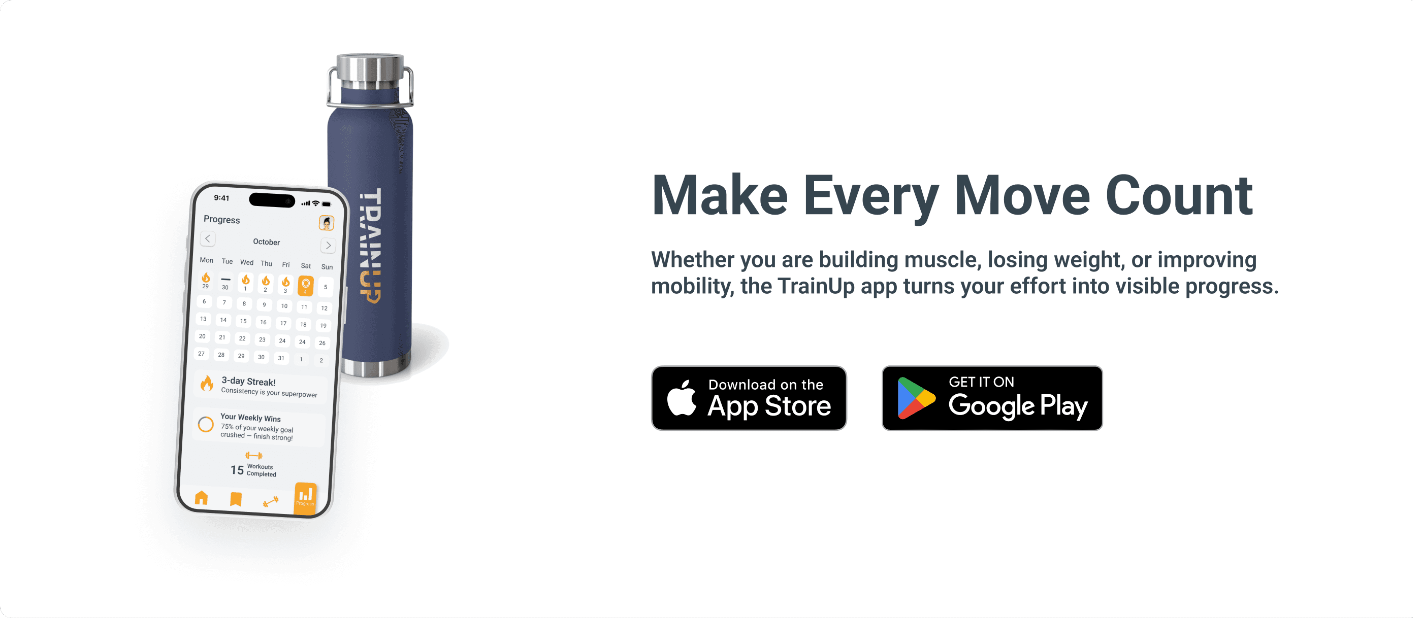
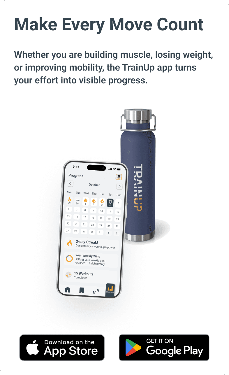
Most fitness stores just sell products. TrainUp’s store also guides people into the app. Someone finds the store first, buys equipment, and downloads the app to start training with it.
It works the other way too. Someone finds the app first, needs equipment, and ends up in the store.
The app download section has a prominent place in the store, not hidden in the footer. That’s a deliberate decision to turn a customer into a long-term TrainUp user.
One ecosystem, two ways in. Neither product loses a user.
the solution
The finished store
The finished store
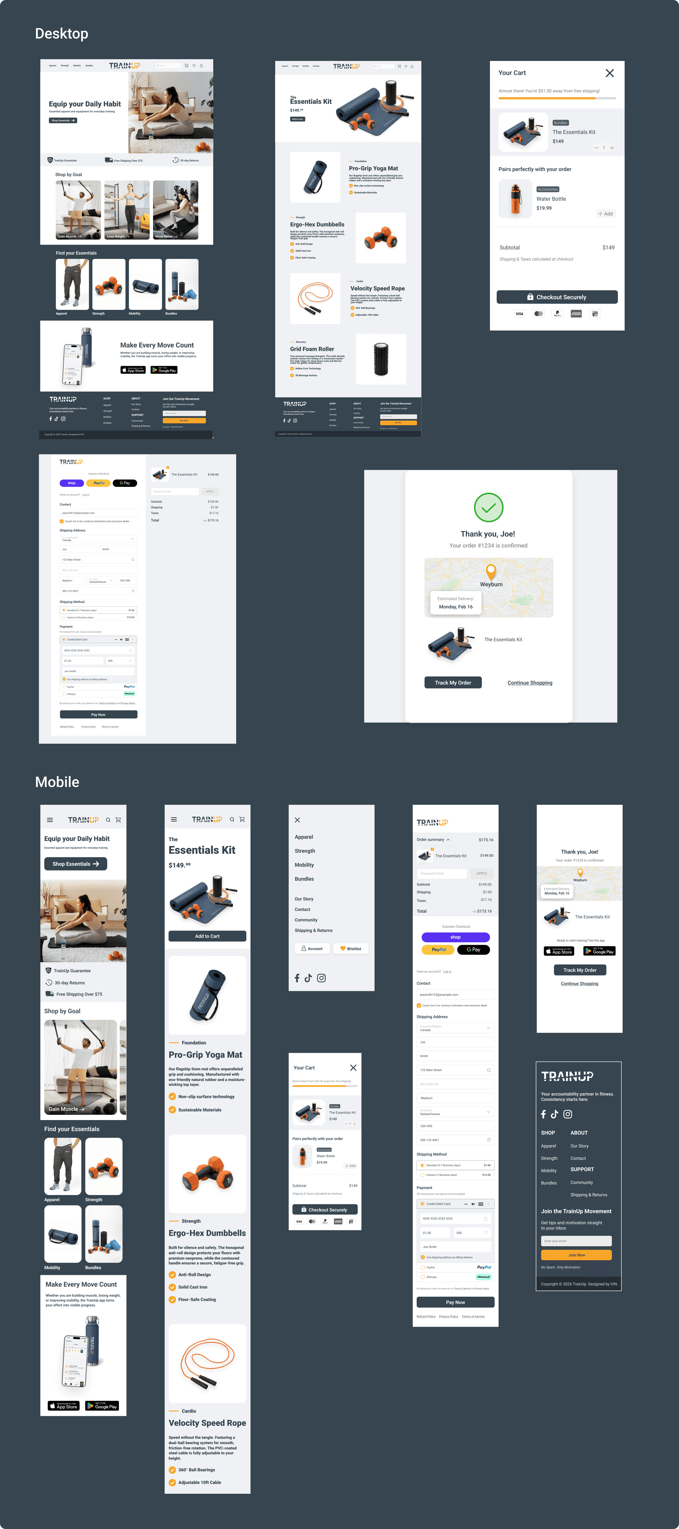
Shopping by goal, curated bundles, the slide-out cart, and a simple checkout all led here. A fitness store that helps people find exactly what they need, without getting lost.
Five screens, one clear path, and no dead ends.
the ecosystem
One brand, three connected products
One brand, three connected products
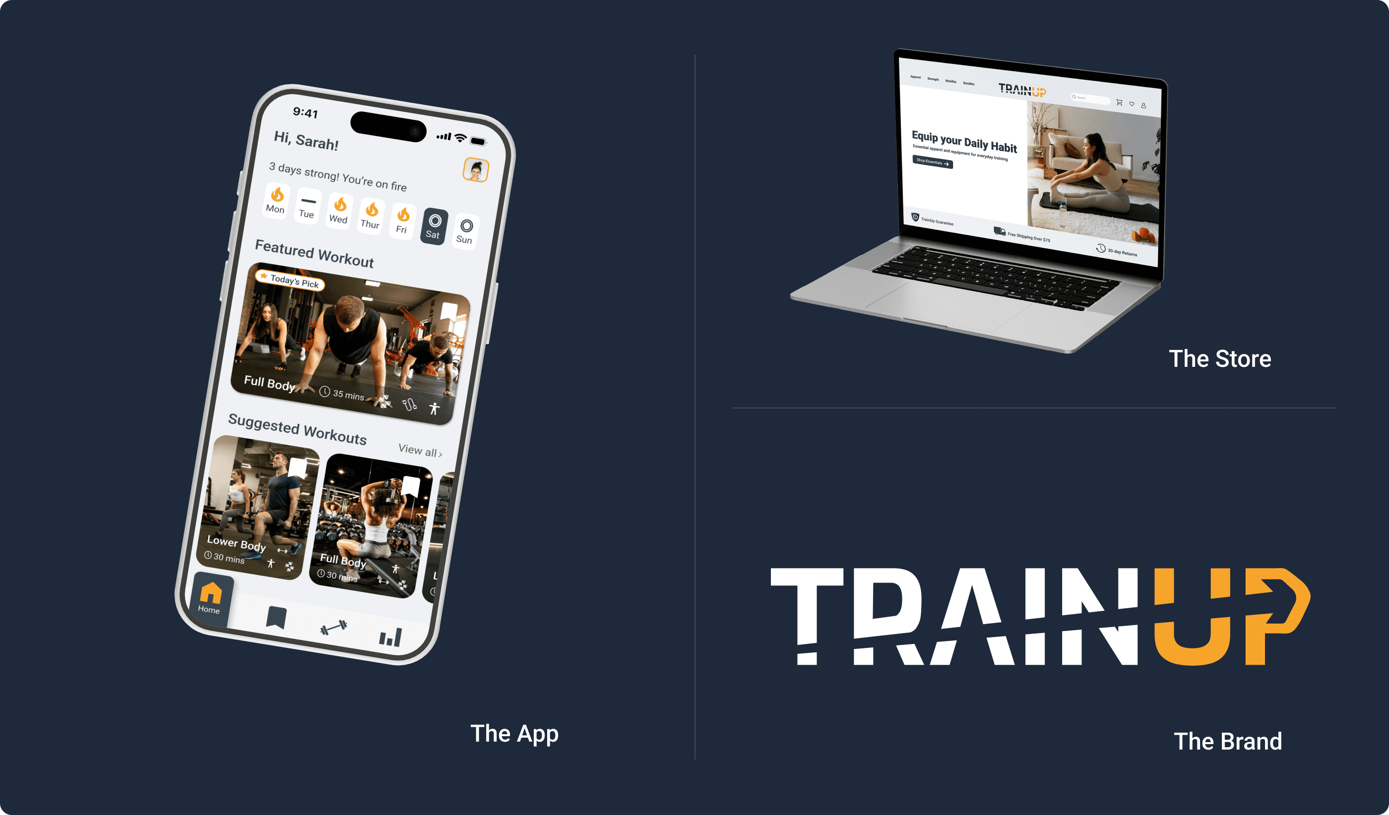
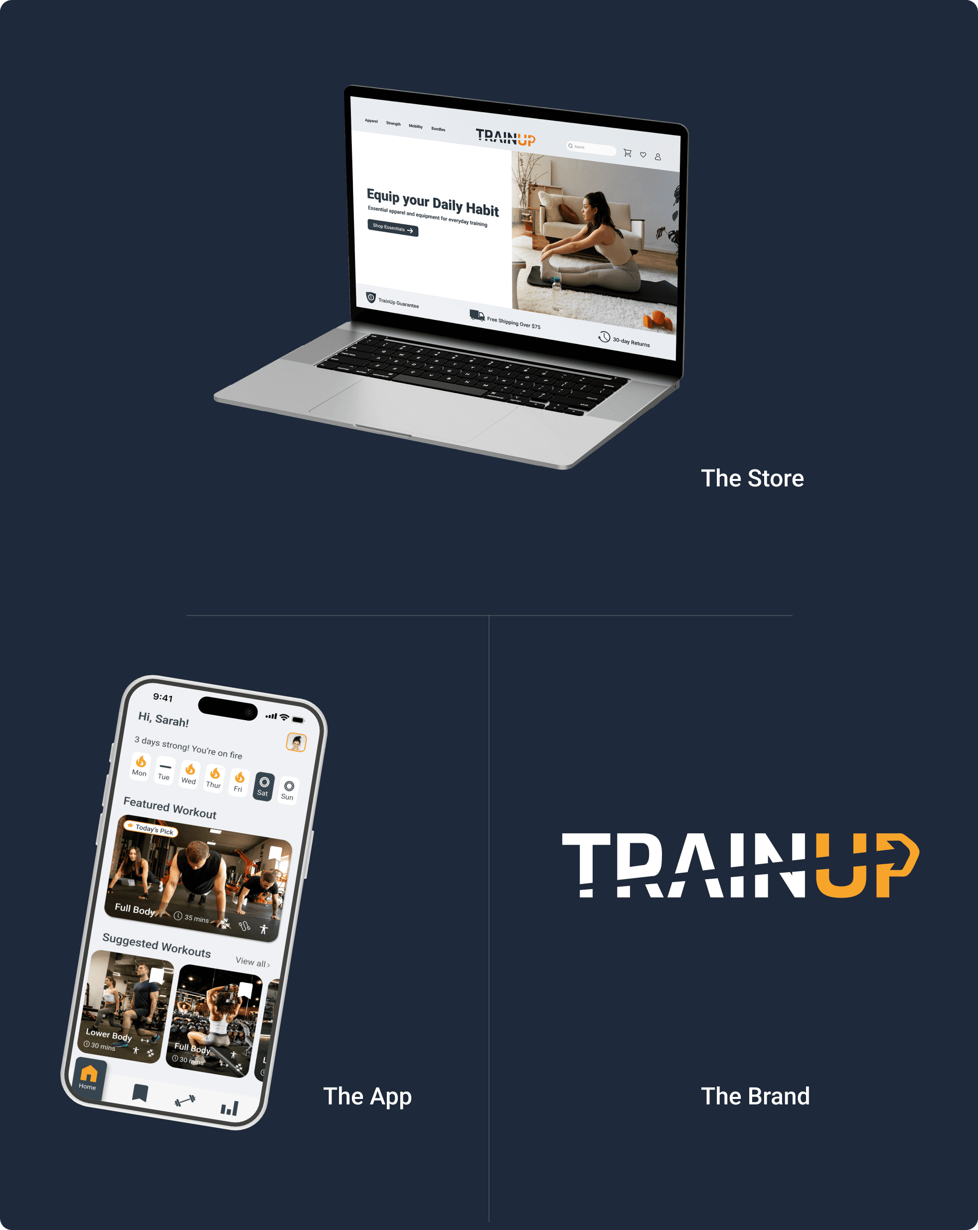
The store doesn’t exist on its own. It’s one part of a connected system: the app tracks your goals, the store has the equipment, and the brand ties it all together. Every purchase brings users closer to the full TrainUp experience.
The store doesn’t exist on its own. It’s one part of a connected system: the app tracks your goals, the store has the equipment, and the brand ties it all together. Every purchase brings users closer to the full TrainUp experience.
The connection
The brand identity is the foundation. Every color, typeface, and design decision in the app and the store comes from it. So TrainUp isn’t three projects with the same name. It’s one ecosystem with three ways in.
The brand identity is the foundation. Every color, typeface, and design decision in the app and the store comes from it. So TrainUp isn’t three projects with the same name. It’s one ecosystem with three ways in.
How they work together
A user downloads TrainUp and starts working out at home. Over time, they want better equipment. The store is the next step, organized around the same goals the app is built on.
Or a user finds TrainUp through the store, and the app becomes their next step. Each product leads to the other, which helps keep users that one product alone might lose.
The visual system
The app, the store, and the brand share the same colors, typography, and design language. Moving between the app and the store feels like the same place. That’s the design system doing its job.
The app, the store, and the brand share the same colors, typography, and design language. Moving between the app and the store feels like the same place. That’s the design system doing its job.
This is product thinking at the system level.
the REFLECTION
What the store taught me
What the store taught me
What I'm Most Proud Of
What I'm Most Proud Of
Shop by Goal. It sounds simple: organize products by what the user wants to achieve, instead of what the product is. But that one decision shapes the whole experience.
Shop by Goal. It sounds simple: organize products by what the user wants to achieve, instead of what the product is. But that one decision shapes the whole experience.
What I'd Do Differently
What I'd Do Differently
Shop by Goal. It sounds simple: organize products by what the user wants to achieve, instead of what the product is. But that one decision shapes the whole experience.
Shop by Goal. It sounds simple: organize products by what the user wants to achieve, instead of what the product is. But that one decision shapes the whole experience.
What's Next
Connect the store directly to the app, with product recommendations based on each user’s TrainUp goals and equipment.
Connect the store directly to the app, with product recommendations based on each user’s TrainUp goals and equipment.
The best online store doesn’t feel like shopping. It feels like finding exactly what you needed.