about the project
TrainUp — Brand Identity
TrainUp — Brand Identity
Before the app. Before the store. There was a brand. Every color, every typeface, every design decision in the TrainUp ecosystem started here.
Before the app. Before the store. There was a brand. Every color, every typeface, every design decision in the TrainUp ecosystem started here.
Case Study
Branding
Visual Design
Design Systems
B2C
MY ROLE
UX/UI Designer
UX/UI Designer
TOOLS
Figma · PS · Affinity
Figma · PS · Affinity
TYPE
Concept Project
Concept Project
the brief
A brand built from a feeling
A brand built from a feeling
TrainUp started with a name. Not a product, not a brief — a name that said exactly what it meant. Train up. Improve. Move forward. From there, everything else had to match that feeling.
Most fitness brands felt cold, aggressive, or out of reach. I wanted something different — a brand that felt human and relatable without losing the energy. Something that could motivate you without intimidating you.
That was the only brief. Build a brand that feels like it's on your side.
the problem
Fitness brands all look like they're yelling at you
Fitness brands all look like they're yelling at you
Look at most fitness brands and you'll notice the same thing — aggressive typography, high contrast, dark colors, imagery that makes you feel inadequate before you've even started. They're designed to intimidate, not invite.
The problem wasn't just aesthetic. It was emotional. These brands have no personality, no warmth, nothing that makes you feel like the brand is on your side.
TrainUp had to solve a specific design challenge — create something that felt energetic without being aggressive, and colorful without feeling cheap or childish. That balance is harder than it sounds.
How might we build a fitness brand that energizes people instead of intimidating them?
How might we build a fitness brand that energizes people instead of intimidating them?
The goal wasn't to be louder. It was to be different.
The goal wasn't to be louder. It was to be different.
the PROCESS
Every decision had a reason
Every decision had a reason
The TrainUp identity didn't come from a template or a trend. It was built decision by decision — the name, the mark, the colors, the type. Each one chosen deliberately to support the same idea.
The TrainUp identity didn't come from a template or a trend. It was built decision by decision — the name, the mark, the colors, the type. Each one chosen deliberately to support the same idea.
It was always going to end in 'Up
It was always going to end in 'Up
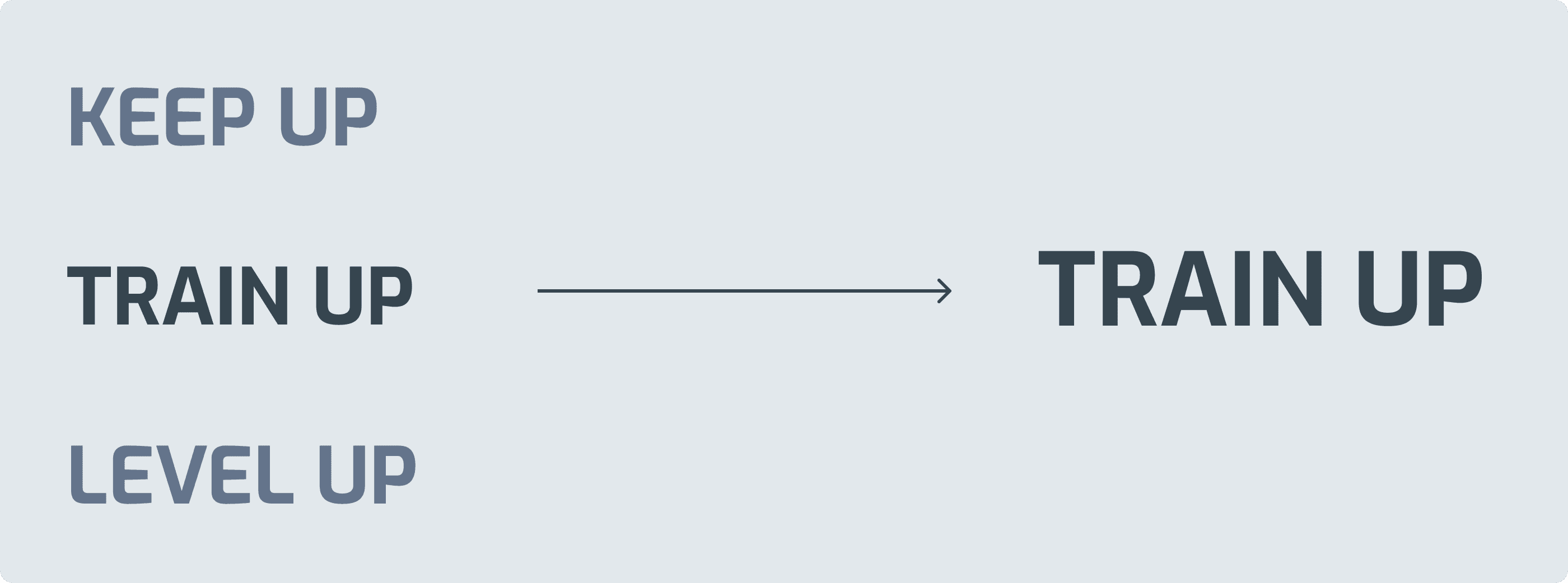
Three options. All different — but they all pointed in the same direction. Level Up, Keep Up, Train Up. The 'up' was never negotiable. It was the whole idea — improvement, momentum, forward motion. Train Up won because it was the most direct. It tells you exactly what to do.
Three options. All different — but they all pointed in the same direction. Level Up, Keep Up, Train Up. The 'up' was never negotiable. It was the whole idea — improvement, momentum, forward motion. Train Up won because it was the most direct. It tells you exactly what to do.
The name came first. Everything else had a direction to follow.
The name came first. Everything else had a direction to follow.
From wordmark to mark
The arrow was never decorative
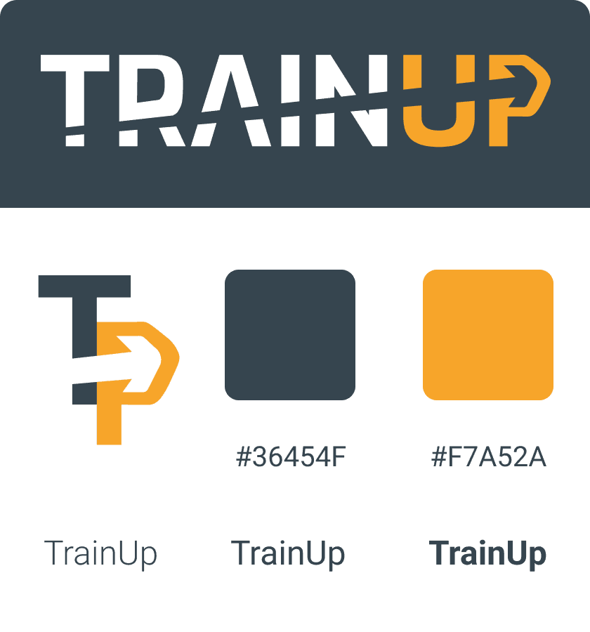
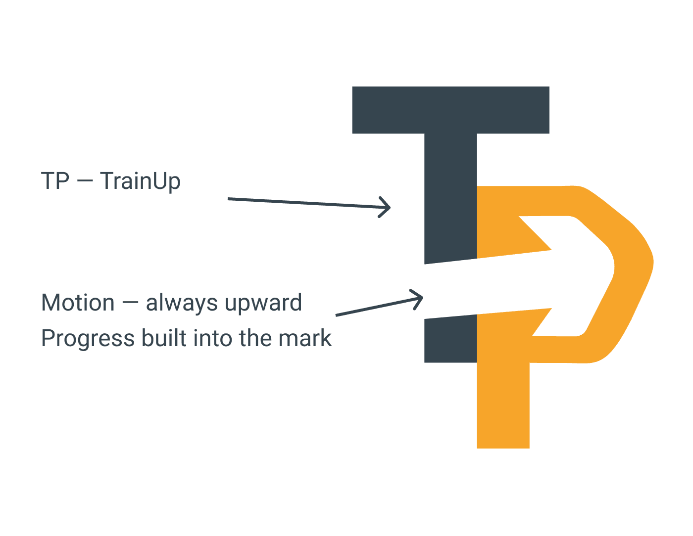
The TP monogram combines two letters into one mark — but the arrow is the real idea. It points up and forward. That's the whole brand in one shape. Train up. Move forward. Every time someone sees the mark, that's what it says.
One shape. One direction. The whole brand in one mark.
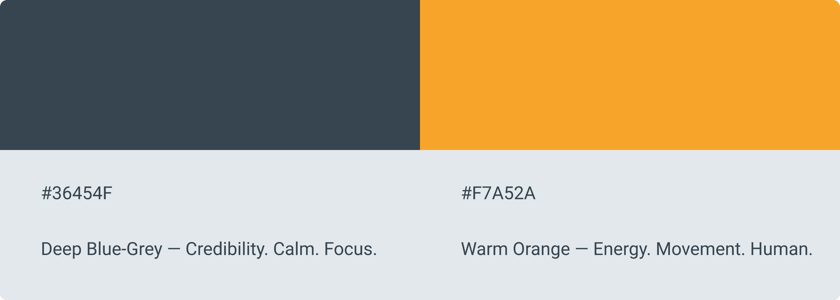
Energy without aggression
The color system had to solve one problem — feel energetic without feeling aggressive. The deep blue-grey grounds the brand, gives it credibility and calm. The orange brings the energy — but it's warm, not loud. Together they feel focused and human, not intimidating.
Two colors. One does the talking. The other holds it together.
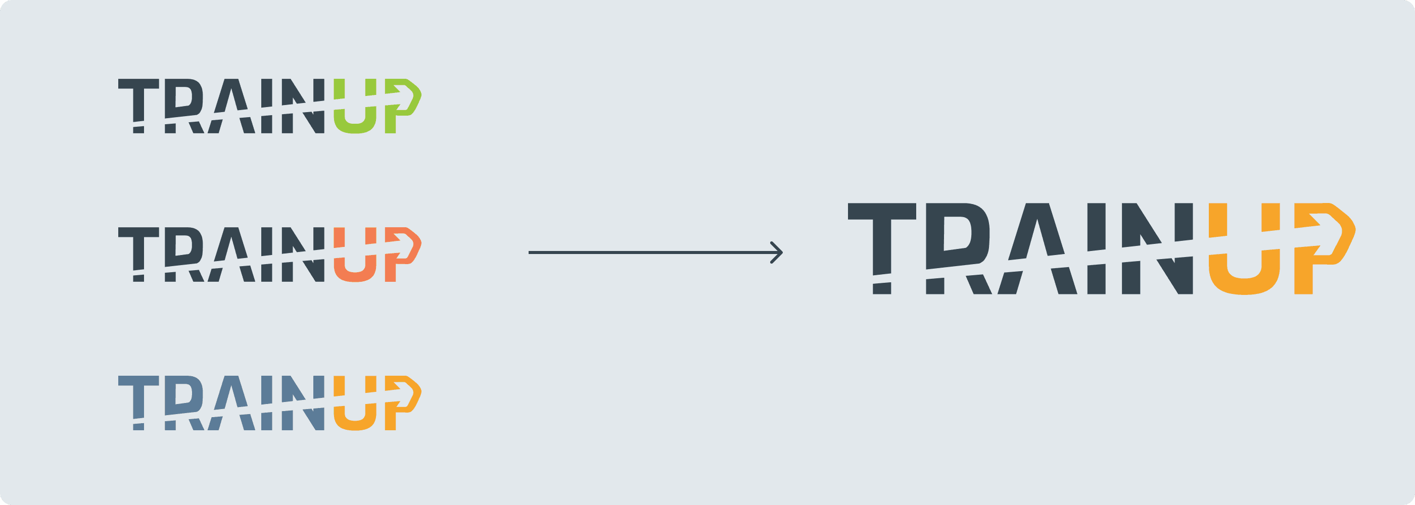
The wordmark came first. Multiple iterations — different weights, different arrow treatments, different ways to make TRAINUP feel like it was moving forward.
Once the wordmark was settled, the TP monogram came naturally as a compact version of the same idea. Same energy, smaller footprint.
The short version wasn't a separate idea. It was the same idea, distilled.
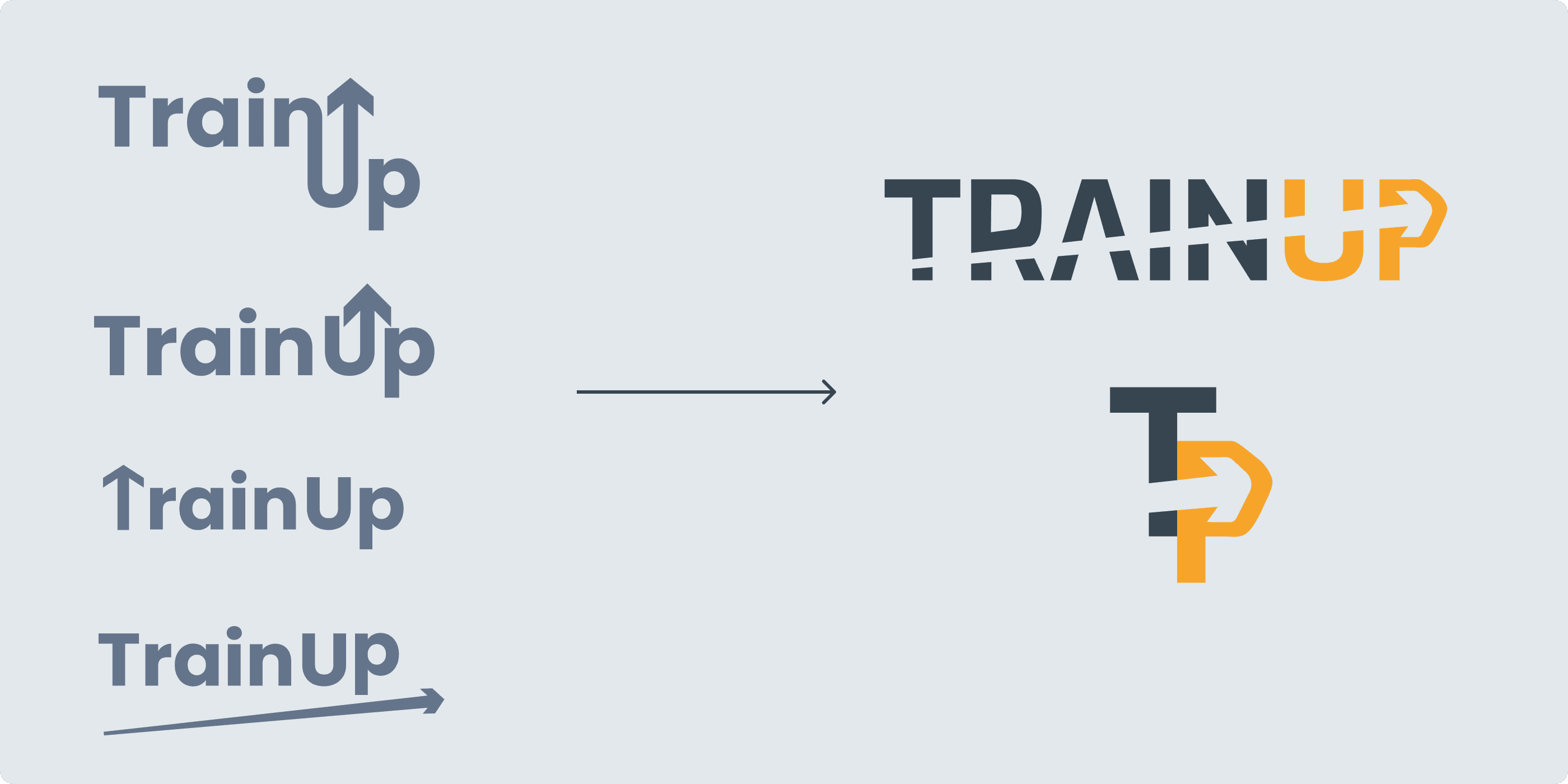
The arrow was never decorative
The TP monogram combines two letters into one mark — but the arrow is the real idea. It points up and forward. That's the whole brand in one shape. Train up. Move forward. Every time someone sees the mark, that's what it says.
One shape. One direction. The whole brand in one mark.
Energy without aggression
From wordmark to mark
The color system had to solve one problem — feel energetic without feeling aggressive. The deep blue-grey grounds the brand, gives it credibility and calm. The orange brings the energy — but it's warm, not loud. Together they feel focused and human, not intimidating.
The color system had to solve one problem — feel energetic without feeling aggressive. The deep blue-grey grounds the brand, gives it credibility and calm. The orange brings the energy — but it's warm, not loud. Together they feel focused and human, not intimidating.
Two colors. One does the talking. The other holds it together.
The wordmark came first. Multiple iterations — different weights, different arrow treatments, different ways to make TRAINUP feel like it was moving forward.
Once the wordmark was settled, the TP monogram came naturally as a compact version of the same idea. Same energy, smaller footprint.
The short version wasn't a separate idea. It was the same idea, distilled.
The final colors weren't the first choice. Different combinations were tested against the same mark — but the decision wasn't just about what looked good. Color psychology played a big role. Every color carries meaning and triggers a feeling. The deep blue-grey communicates trust, stability, and focus. The warm orange signals energy, optimism, and movement. Together they say exactly what TrainUp stands for.
Two colors. One does the talking. The other holds it together.
One typeface. Every weight.
One typeface. Every weight.
Roboto was the only choice that made sense. Clean, modern, and functional — it doesn't fight for attention. The logo uses Exo Bold for its distinct personality and energy. Roboto handles everything else — UI, body copy, labels — across the app, the store, and every touchpoint in the ecosystem.
Roboto was the only choice that made sense. Clean, modern, and functional — it doesn't fight for attention. The logo uses Exo Bold for its distinct personality and energy. Roboto handles everything else — UI, body copy, labels — across the app, the store, and every touchpoint in the ecosystem.
Every decision had a reason. Nothing was decorative.
Every decision had a reason. Nothing was decorative.
Roboto was the only choice that made sense. Clean, modern, and functional — it doesn't fight for attention. The logo uses Exo Bold for its distinct personality and energy. Roboto handles everything else — UI, body copy, labels — across the app, the store, and every touchpoint in the ecosystem.
Every decision had a reason. Nothing was decorative.
the SOLUTION
The finished identity
The finished identity
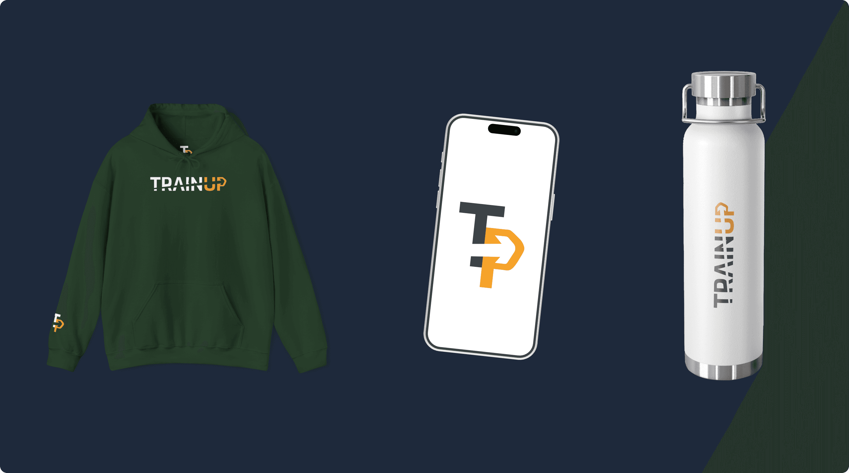
Every decision — the name, the mark, the colors, the type — came together into one cohesive system.
A brand that feels energetic without being aggressive, human without being soft, and flexible enough to live across an app, a store, and every touchpoint in between.
Every decision — the name, the mark, the colors, the type — came together into one cohesive system.
A brand that feels energetic without being aggressive, human without being soft, and flexible enough to live across an app, a store, and every touchpoint in between.
A brand that knows what it is — and looks like it.
A brand that knows what it is — and looks like it.
the ecosystem
One brand. Three products. One experience.
One brand. Three products. One experience.
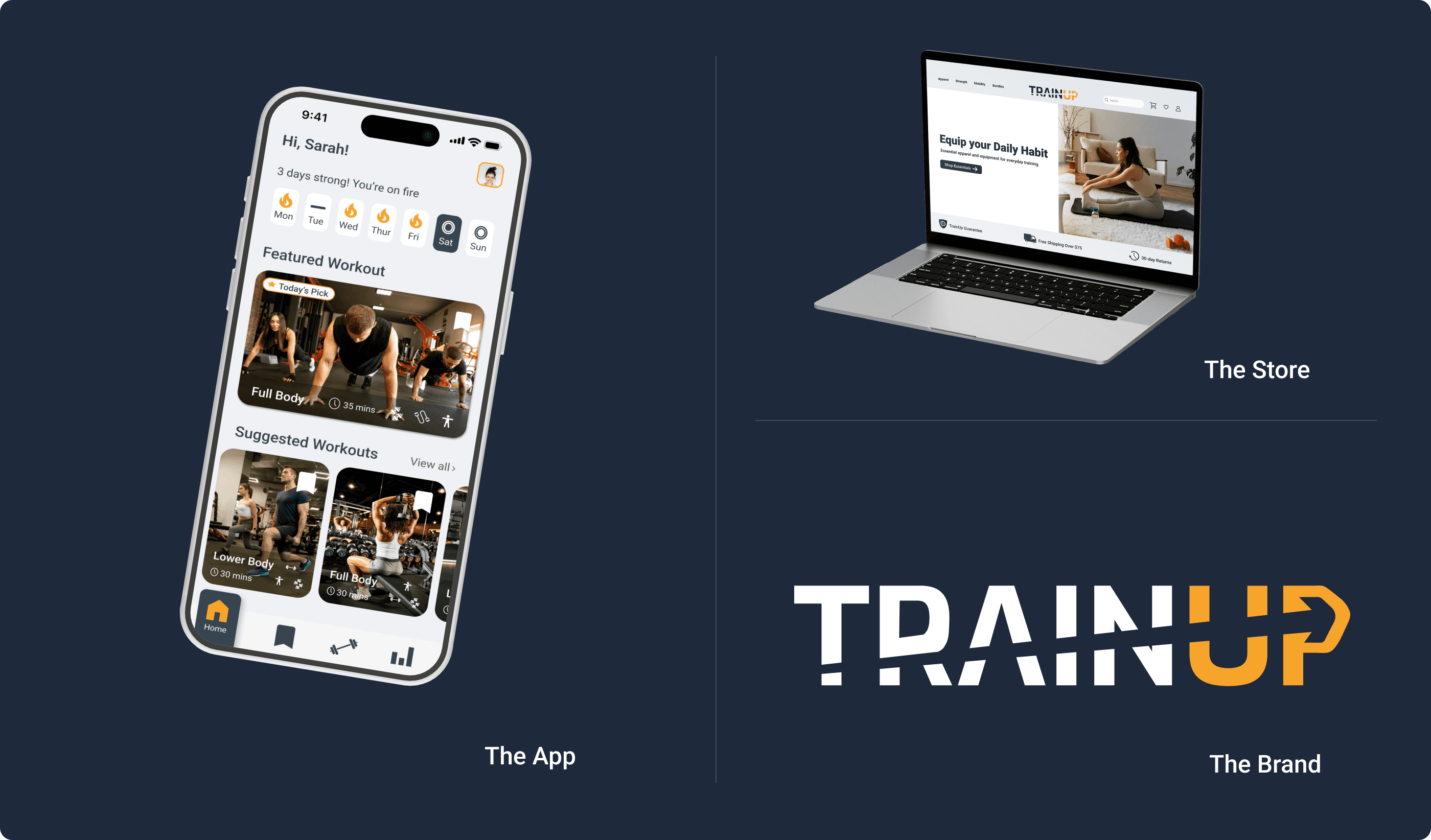
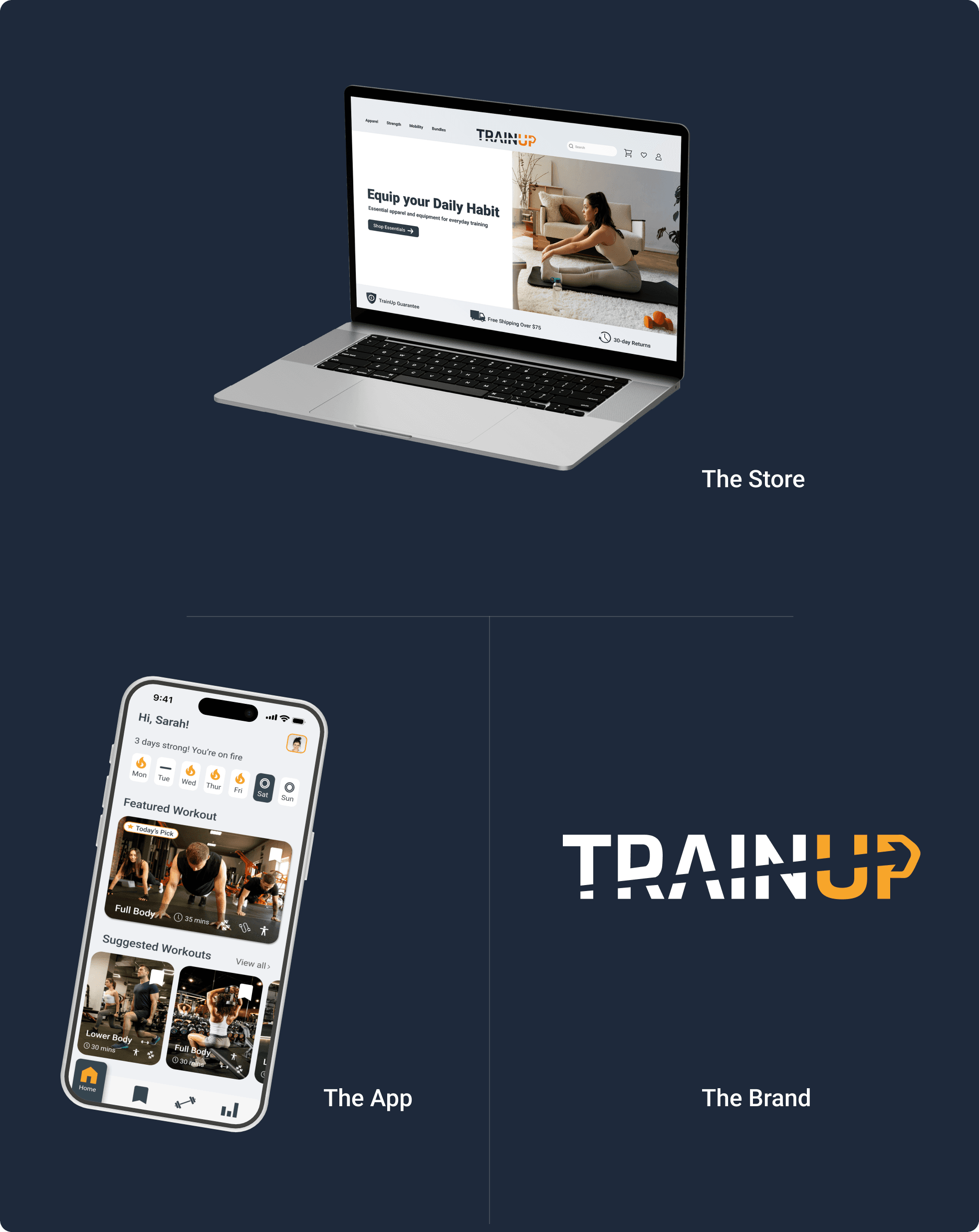
Most portfolio projects are a single deliverable. TrainUp is three connected products designed to work as one system.
Most portfolio projects are a single deliverable. TrainUp is three connected products designed to work as one system.
The Connection
The Brand Identity is the visual foundation — every color, every typeface, every design decision in both the app and the store flows from it. It's not three separate projects that happen to share a name. It's one product ecosystem with three entry points.
The Brand Identity is the visual foundation — every color, every typeface, every design decision in both the app and the store flows from it. It's not three separate projects that happen to share a name. It's one product ecosystem with three entry points.
How They Work Together
A user downloads TrainUp and starts working out at home. Over time they want better equipment — the store is the natural next step, organized around the same goals the app already knows about them.
A user discovers TrainUp through the store. The app is the natural next step. One product leads to the other. The ecosystem retains users that either product alone would lose.
The Visual System
Every touchpoint — app, store, brand identity — shares the same color system, typography, and design language. A user moving between the app and the store never feels like they've left. That's not a coincidence. That's a design system doing its job.
Every touchpoint — app, store, brand identity — shares the same color system, typography, and design language. A user moving between the app and the store never feels like they've left. That's not a coincidence. That's a design system doing its job.
The identity didn't follow the products. The products followed the identity.
the REFLECTION
What building a brand taught me
What building a brand taught me
What I'm Most Proud Of
What I'm Most Proud Of
The name. It sounds like the smallest decision but it was the most important one. Everything else — the mark, the colors, the type — had a direction to follow because the name already said what the brand was about. That clarity made every decision after it easier.
The name. It sounds like the smallest decision but it was the most important one. Everything else — the mark, the colors, the type — had a direction to follow because the name already said what the brand was about. That clarity made every decision after it easier.
What I'd Do Differently
What I'd Do Differently
I'd invest more time in the exploration phase. The final identity is strong, but I moved to execution relatively quickly. More iterations — more name options, more mark directions, more color combinations — would have made the final decisions even more confident.
I'd invest more time in the exploration phase. The final identity is strong, but I moved to execution relatively quickly. More iterations — more name options, more mark directions, more color combinations — would have made the final decisions even more confident.
What's Next
Apply the identity system to more touchpoints — marketing materials, social media templates, packaging. The brand is built to scale. It hasn't been fully stretched yet.
Apply the identity system to more touchpoints — marketing materials, social media templates, packaging. The brand is built to scale. It hasn't been fully stretched yet.
A brand isn't a logo. It's the story behind it, the message it carries, and the feeling it leaves behind.