REBRAND + WEBSITE
CAMIC/ACCAM
CAMIC/ACCAM
A full rebrand and website redesign for a national insurance association. Modern, bilingual, and easy for their team to manage. Still live years later.
A full rebrand and website redesign for a national insurance association. Modern, bilingual, and easy for their team to manage. Still live years later.
Case Study
UX/UI
Web Design
Branding
Bilingual
MY ROLE
UX/UI Designer
UX/UI Designer
TOOLS
Illustrator · Photoshop
Adobe XD · WordPress
TYPE
Co-op Project

the brief
A national association with an outdated image
A national association with an outdated image
CAMIC (the Canadian Association of Mutual Insurance Companies) represents mutual insurance companies across Canada. Their brand and website no longer reflected who they were. The identity felt dated, and the site was hard to use and even harder for their team to update. The goal was clear: modernize the brand, rebuild the website from scratch, and make it something CAMIC could maintain on their own, in both official languages.
CAMIC (the Canadian Association of Mutual Insurance Companies) represents mutual insurance companies across Canada. Their brand and website no longer reflected who they were. The identity felt dated, and the site was hard to use and even harder for their team to update. The goal was clear: modernize the brand, rebuild the website from scratch, and make it something CAMIC could maintain on their own, in both official languages.
the problem
A dated brand and a website stuck in the past
A dated brand and a website stuck in the past
The old logo and site didn’t match the credibility of a national association. The website looked outdated, was hard to navigate, and wasn’t responsive. It also wasn’t built for easy editing, so even small updates were a struggle for the CAMIC team.
On top of that, the site had to be fully bilingual, in English and French. At the time there were no simple tools for this, so everything was handled manually. It was also a design challenge on its own: English and French sentences aren’t the same length, so the layouts had to stay flexible enough to look right in both languages.
The challenge: rebuild the brand and the site into something modern, responsive, easy to maintain, and bilingual, without losing the trust CAMIC had built over decades.
The old logo and site didn’t match the credibility of a national association. The website looked outdated, was hard to navigate, and wasn’t responsive. It also wasn’t built for easy editing, so even small updates were a struggle for the CAMIC team.
On top of that, the site had to be fully bilingual, in English and French. At the time there were no simple tools for this, so everything was handled manually. It was also a design challenge on its own: English and French sentences aren’t the same length, so the layouts had to stay flexible enough to look right in both languages.
The challenge: rebuild the brand and the site into something modern, responsive, easy to maintain, and bilingual, without losing the trust CAMIC had built over decades.
How might we bring a dated national brand into the modern web, clean, responsive, and bilingual, while keeping the trust it earned over decades?
How might we bring a dated national brand into the modern web, clean, responsive, and bilingual, while keeping the trust it earned over decades?
the BEFORE
What wasn’t working
What wasn’t working
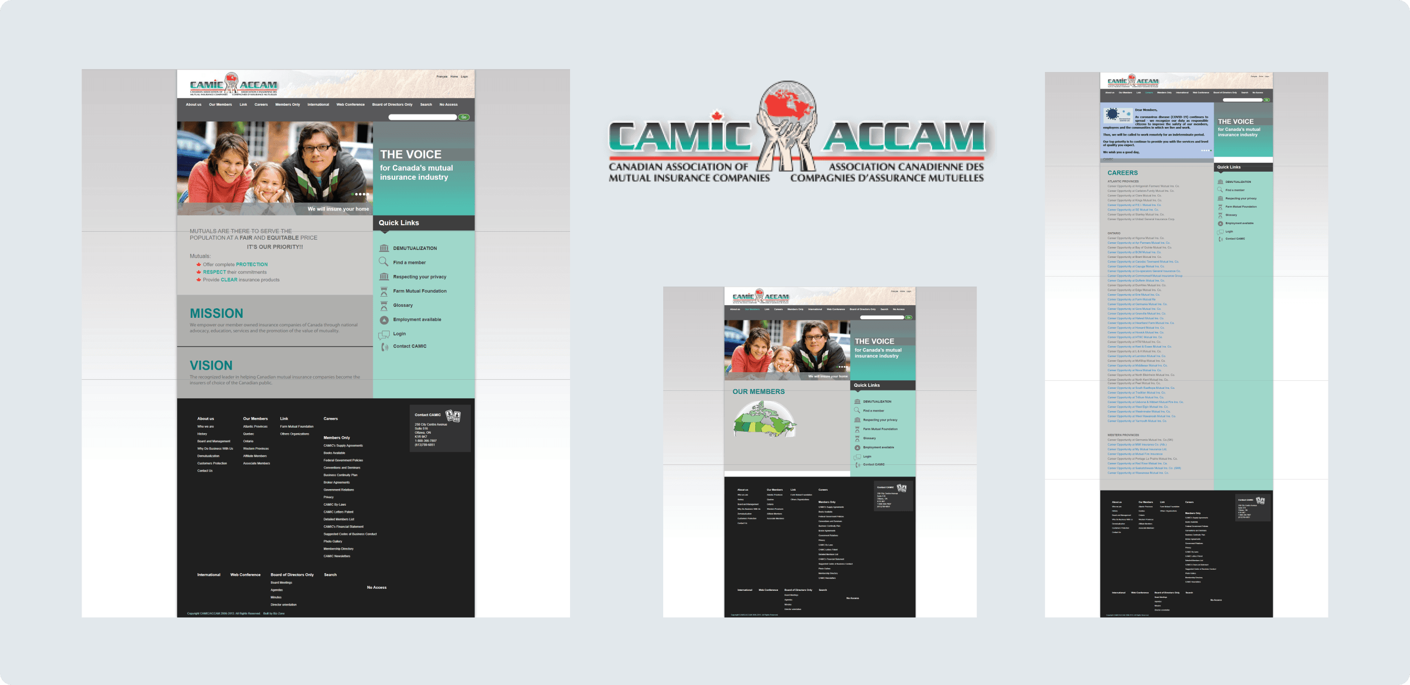
Before redesigning anything, I looked honestly at what wasn’t working. The old site felt dated and cluttered, the navigation made key information hard to find, and nothing adapted to different screen sizes. The logo also felt stuck in an earlier era. It didn’t carry the weight of a national association.
Before redesigning anything, I looked honestly at what wasn’t working. The old site felt dated and cluttered, the navigation made key information hard to find, and nothing adapted to different screen sizes. The logo also felt stuck in an earlier era. It didn’t carry the weight of a national association.

the BRANDING
A brand with intention behind it
A brand with intention behind it
The old logo felt dated and didn’t carry the weight of a national association. As a team, we brainstormed the keywords and values that define CAMIC: Mutual, Leader, National, Community, Local, and Insurance. We sketched ideas together before choosing a direction, and then I designed the final logo in Illustrator.
The logo was built around three ideas:
The maple leaf — the national identity (Canada)
The unifying ring — CAMIC bringing its members together
The community — the people at the center of it all
The colors follow the same thinking: red for Canada, orange for strength and leadership, and yellow for warmth, balanced with grey for reliability and charcoal for authority. The result is a modern, confident identity that matches the credibility of the association behind it.
Every element has a meaning. Nothing is there by accident.
The old logo felt dated and didn’t carry the weight of a national association. As a team, we brainstormed the keywords and values that define CAMIC: Mutual, Leader, National, Community, Local, and Insurance. We sketched ideas together before choosing a direction, and then I designed the final logo in Illustrator.
The logo was built around three ideas:
The maple leaf — the national identity (Canada)
The unifying ring — CAMIC bringing its members together
The community — the people at the center of it all
The colors follow the same thinking: red for Canada, orange for strength and leadership, and yellow for warmth, balanced with grey for reliability and charcoal for authority. The result is a modern, confident identity that matches the credibility of the association behind it.
Every element has a meaning. Nothing is there by accident.
The old logo felt dated and didn't carry the weight of a national association. As a team, we brainstormed the keywords and values that define CAMIC — Mutual, Leader, National, Community, Local, and Insurance — and sketched ideas together before deciding on a direction. From there, I designed the final logo in Illustrator.
The logo took shape around three ideas:
The maple leaf — the national identity (Canada)
The unifying ring — CAMIC bringing its members together
The community — the people at the center of it all
The color system carried the same intention: red for Canada, orange for strength and leadership, and yellow for warmth — grounded with neutral grey and a deep charcoal for balance. The result is a modern, confident identity that finally matches the credibility of the association behind it.

the PROCESS
A reason behind every page
A reason behind every page
With the brand direction set, the focus moved to the website. Before designing a single screen, we mapped out the full structure of the site, organizing everything from the main pages to the member area into a clear sitemap. For a content-heavy association site, getting this right was what would make it easy to navigate and easy for CAMIC to maintain.
From there, we sketched early wireframes by hand to test layouts quickly, decide what belonged where, and agree on a direction as a team before moving into design. Working on paper first kept the focus on usability and flow, not just looks.
With the brand direction set, the focus moved to the website. Before designing a single screen, we mapped out the full structure of the site, organizing everything from the main pages to the member area into a clear sitemap. For a content-heavy association site, getting this right was what would make it easy to navigate and easy for CAMIC to maintain.
From there, we sketched early wireframes by hand to test layouts quickly, decide what belonged where, and agree on a direction as a team before moving into design. Working on paper first kept the focus on usability and flow, not just looks.
With the brand direction set, the focus moved to the website itself. Before designing a single screen, we mapped out the full structure of the site — organizing everything from the main pages to the member area into a clear, logical sitemap. For a content-heavy association site, getting this structure right was what would make the site easy to navigate and easy for CAMIC to maintain.
From there, we sketched early wireframes by hand to test layouts quickly, decide what belonged where, and agree on a direction as a team before moving into design. Working through the structure on paper first kept the focus on usability and flow, not just looks.
Good structure is invisible — you only notice when it's missing.
Good structure is invisible. You only notice it when it’s missing.
Information Architecture
Information Architecture


Sketching the Layouts

Sketching the Layouts

the UX IMPROVEMENTS
Every change had a reason
Every change had a reason
Redesigning the visual identity was only part of the challenge. The old website had real usability problems that made it harder for users to find what they needed and for CAMIC to manage their own content. These are the three areas where UX decisions made the biggest difference.
Redesigning the visual identity was only part of the challenge. The old website had real usability problems that made it harder for users to find what they needed and for CAMIC to manage their own content. These are the three areas where UX decisions made the biggest difference.
With the brand direction set, the focus moved to the website itself. Before designing a single screen, we mapped out the full structure of the site — organizing everything from the main pages to the member area into a clear, logical sitemap. For a content-heavy association site, getting this structure right was what would make the site easy to navigate and easy for CAMIC to maintain.
From there, we sketched early wireframes by hand to test layouts quickly, decide what belonged where, and agree on a direction as a team before moving into design. Working through the structure on paper first kept the focus on usability and flow, not just looks.
Good structure is invisible — you only notice when it's missing.
Improvement 1: Navigation & hierarchy
Improvement 1: Navigation & hierarchy
The old navigation was cluttered with unnecessary items, including a “No Access” button that everyone could see, and there was no clear hierarchy between sections. Users couldn’t quickly tell where they were or where to go next. We simplified the navigation to what users actually needed, created a clear visual hierarchy, and made the call to action obvious.
The old navigation was cluttered with unnecessary items, including a “No Access” button that everyone could see, and there was no clear hierarchy between sections. Users couldn’t quickly tell where they were or where to go next. We simplified the navigation to what users actually needed, created a clear visual hierarchy, and made the call to action obvious.


Improvement 2: Footer & information architecture
The old footer was overwhelming. Dozens of links, many of them irrelevant, and the contact information was buried and too small to read. We cut it down to the most relevant links and made the contact information clear and easy to find.
The old footer was overwhelming. Dozens of links, many of them irrelevant, and the contact information was buried and too small to read. We cut it down to the most relevant links and made the contact information clear and easy to find.


Improvement 3: Role-based access
CAMIC has three types of users: the general public, members, and board members. Each one has different needs and access levels. The old site treated everyone the same, so members had to dig through public content to find what was relevant to them.
We designed a role-based experience. The public sees a clean public site. Members get a private menu and their own home page. Board members have a separate account with restricted content. Each user sees exactly what they need.
CAMIC has three types of users: the general public, members, and board members. Each one has different needs and access levels. The old site treated everyone the same, so members had to dig through public content to find what was relevant to them.
We designed a role-based experience. The public sees a clean public site. Members get a private menu and their own home page. Board members have a separate account with restricted content. Each user sees exactly what they need.


Good UX is about making sure the right person finds the right thing at the right time.
Good UX is about making sure the right person finds the right thing at the right time.
the solution
A modern site, built to last
A modern site, built to last
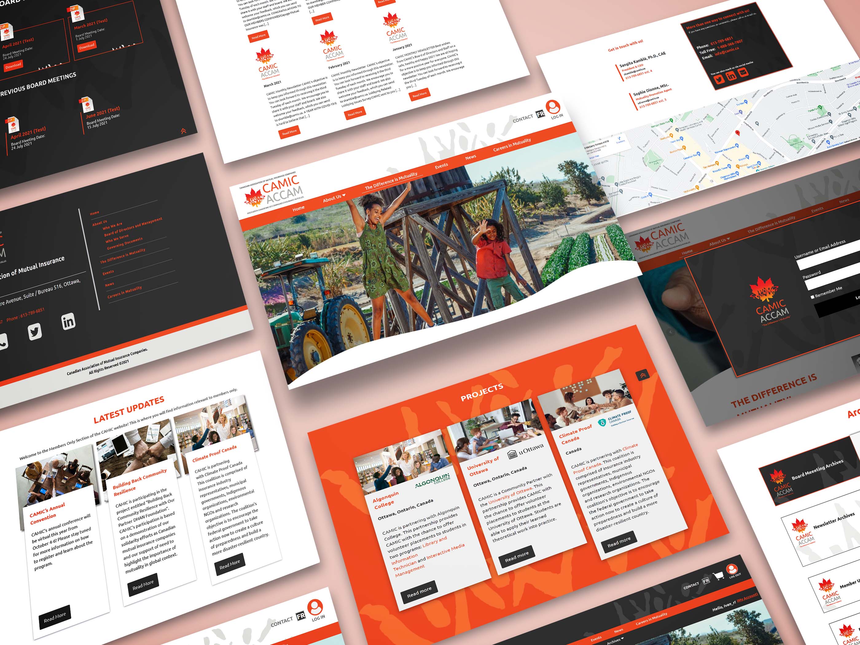
The final website brought everything together: the new brand, a clear structure, and a clean, modern design that matched the credibility of a national association. It’s fully responsive, so it works just as well on a phone as on a desktop.
Just as important, the site was built so the CAMIC team could manage and update it themselves. It handles English and French throughout, with layouts flexible enough to work in both languages.
The proof is in how long it lasted: years later, the site is still live and still serving CAMIC, largely as we designed it.
Good design doesn’t only launch well. It lasts.
Good design doesn't just launch — it lasts.
Good design doesn't just launch — it lasts.
Visit the Live Site

Visit the Live Site
the REFLECTION
What this project taught me
What this project taught me
What I'm Most Proud Of
What I'm Most Proud Of
The site is still live. Years later, camic.ca is still running largely as we designed it, and the CAMIC team manages it themselves. That’s what I’m most proud of. More than the visual design or the new logo, it’s the fact that we built something that lasted, and that the organization could own. Good design should outlive the project.
The site is still live. Years later, camic.ca is still running largely as we designed it, and the CAMIC team manages it themselves. That’s what I’m most proud of. More than the visual design or the new logo, it’s the fact that we built something that lasted, and that the organization could own. Good design should outlive the project.
What I'd Do Differently
What I'd Do Differently
We designed in English first and translated into French after, and that’s when things started breaking. French sentences are longer, so sections that looked clean in English became cramped or misaligned in French. Now I’d do it differently. For a bilingual product, translation can’t be the last step. It has to be part of the design process from day one.
I’d also spend more time at the start understanding users’ specific pain points before redesigning everything at once. Fix the biggest problems first, test them, then move on. Do less, but do it better.
We designed in English first and translated into French after, and that’s when things started breaking. French sentences are longer, so sections that looked clean in English became cramped or misaligned in French. Now I’d do it differently. For a bilingual product, translation can’t be the last step. It has to be part of the design process from day one.
I’d also spend more time at the start understanding users’ specific pain points before redesigning everything at once. Fix the biggest problems first, test them, then move on. Do less, but do it better.
What's Next
CAMIC was my first real experience designing for a real organization with real constraints: a bilingual audience, a tight scope, and a team working fully remotely. It’s the foundation I’ve been building on since. The next step is bringing that same thinking to more complex product challenges, with deeper user research, more iteration, and design that keeps improving after launch.
CAMIC was my first real experience designing for a real organization with real constraints: a bilingual audience, a tight scope, and a team working fully remotely. It’s the foundation I’ve been building on since. The next step is bringing that same thinking to more complex product challenges, with deeper user research, more iteration, and design that keeps improving after launch.
Designing for two languages means designing twice. Build that in from the start.